The main focus this week was the data visualization portion of the project, since this week was our ICM final presentation.
Before the presentation, I had wanted to try the program/visualization in Washington Square Park. Surya (who made NSHeyy) had mentioned that it’s easier and faster to pick up router information in open public areas where every device is trying to connect to a wifi spot. I ended up going to a Starbucks, because it’s closer and, more importantly, warmer. I was able to almost immediately see that there were a few NYU students and was able to sniff a “jackpot”. This is the term we serious hackers use to describe people/devices with multiple legible data points, aka this is what I heard Surya say once. Simply, this means with “jackpots”, we can potentially look up the sniffed data to find out specific detailed information about the owner of the device. This is when things can get creepier.
Below is a video of the sniffed result from Starbucks. Skip through the video to see the result overtime and the interaction. Code for the project is here.
Sniffed visualization from Jiashan Wu on Vimeo.
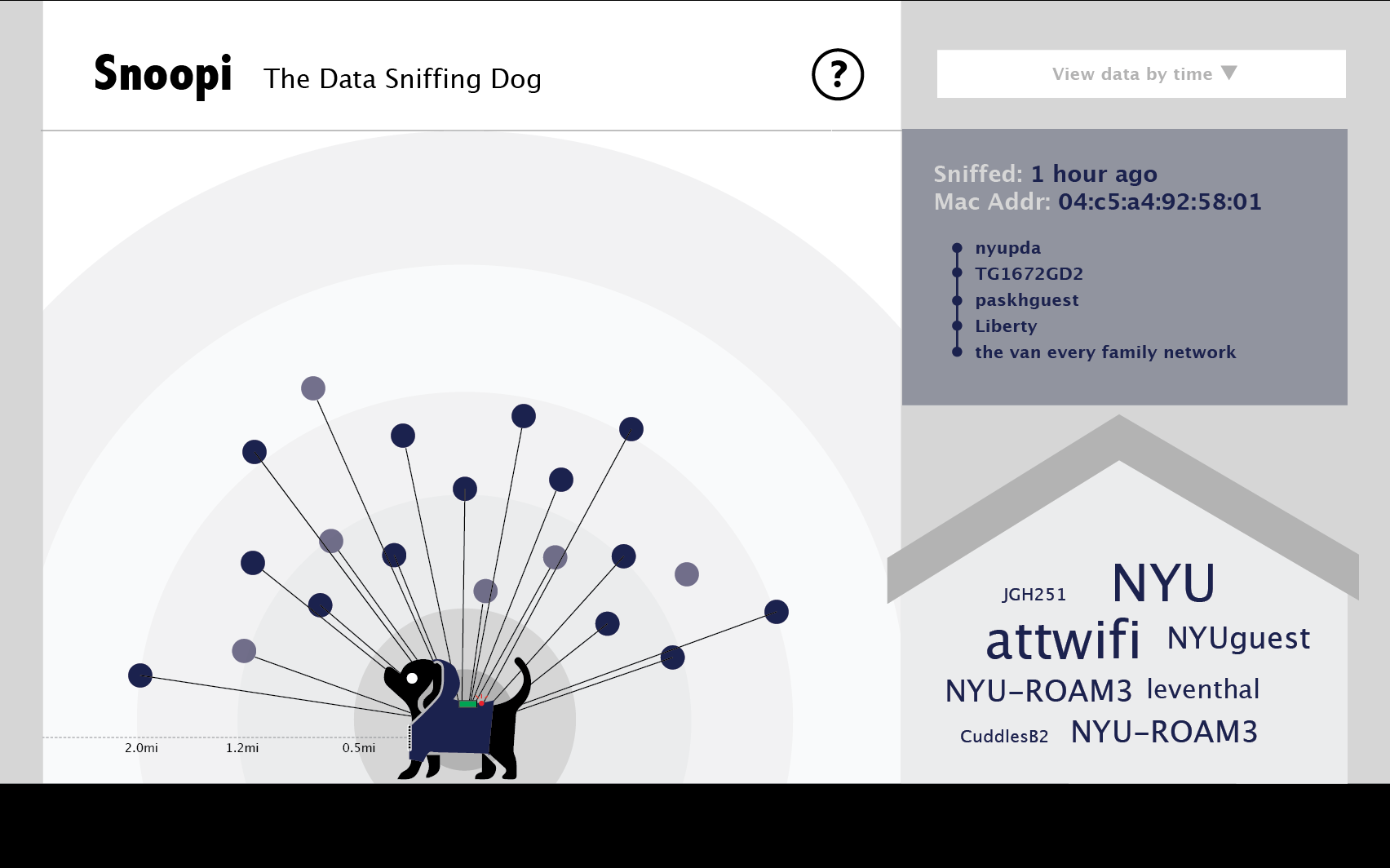
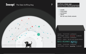
Breaking it down: the visualization is made up of three sections
The left section is where all the sniffed devices are visualized. This is the most dynamic section.
- Each dot is a device
- The radius from a dot to the dog is the estimated distance between the device to where ever the program is running (my computer in this case)
- The size of the dot corresponds to the amount of router information that was sniffed from that device. The more information, the bigger the dot.
- The dots turn green when another device that had been connected to the same router shows up. They are connected by a green line, and they move closer to each other, while maintaining their radial distance.
The top right section is where information of each device shows up when a dot is clicked. This section allows the viewer to zoom in on the data.
- “Sniffed” shows when the last time information was sniffed from the device
- “Device from” shows the company that made the device
- The rest of the section lists out all the unique router names sniffed from the device
The bottom right section is where the aggregate router names are displayed. This section provides a quick overview of the data.
- When a router name is sniffed multiple times from different devices, its text turns green and its text size increases as the instances that the router name is sniffed increases
- After every 20 router names, the first (earliest) router name is removed from the list, unless it’s green.
Stages of discovery: data structure
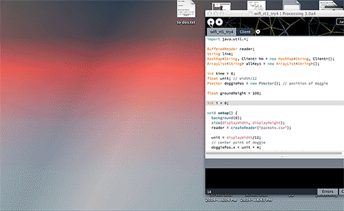
Wireframe: Setup the data structure. Getting the data to display in real time.
This was where I spent the most time on. It took me a while to wrap my mind around using objects in hashmaps. Once I recognized that a new object was created each time when the draw loops through the if statement and then the new object was added to the hashmap, I was able to get past it.
I also used
- Table: to load the vendor information
- stringDict: to store the parsed vendor information, used to match with the MAC addresses to determine the device maker
- intDict: to save all the different router names sniffed from the devices and the count of how many times each router name is sniffed
- ArrayLists: to store all keys in the hashmap; and store all routers sniffed from a device into its object
I would like to dive deeper in data structures and get more comfortable with using them in combination.
Stages of discovery: data visualization

Data visualization rough mockup
Mockup with light background. Too slick looking.
This was another challenge. First it was the organization of the data and what/how should they be displayed. Then it was the animation.
With the organization, I had decided early on the overall layout, but thinking through the details of each section was still tough. For instance, since the only spatial information I was able to base off was the devices’ signal power, it didn’t really matter whether a dot was on the left or right of the dog. So it was hard to clarify that the line connecting the dot to the dog is related to the distance. The background circles and the measurement key was added in the hope to clarify this.
Then it was a matter of visual design. I had tried mocking up a light background. It looked nice and slick, but definitely did not scream “creepy”. So I changed it back to dark. I’m still not very happy with the visual design and animation of the data visualization. I’m not a fan of special effects, and would like to keep each design decision purposeful, but I think I should be able to find a way to make it more engaging while keeping the simplicity.
Feedback
In our first ICM user testing, a few people mentioned that they felt the P Comp side of the project (the doggie wearable sniffer) and the data visualization didn’t seem well connected. From these feedback came the idea of a dog house where information would be stored. Also it was clear that the dog had to be present in the visualization tie it back to the wearable device. Also the name on screen had to be clear it’s dog related and data/spying related. Luckily this name exist in English, hence Snoopi.
In both ICM testing/presentations, people in the class had questioned: why does this matters? How does this data reveal relevant information about someone? Why should I care that I’m leaking breadcrumbs of data from my phone? I’m happy that people are asking these questions, and it’s kind of the point of the project. I don’t know if all this matters. It probably depends on who uses this data and for what. What’s interesting is that we are at a time when none of this is defined yet. The norms of our attitude towards data and data collection is still being formed. Maybe years down the line, we’ll see our data as a form of currency and that ownership should be clearly defined. I have no idea. But I’m hoping to be part of this conversation through Snoopi.
More to do!
- Update some of the design and animation details of the data visualization
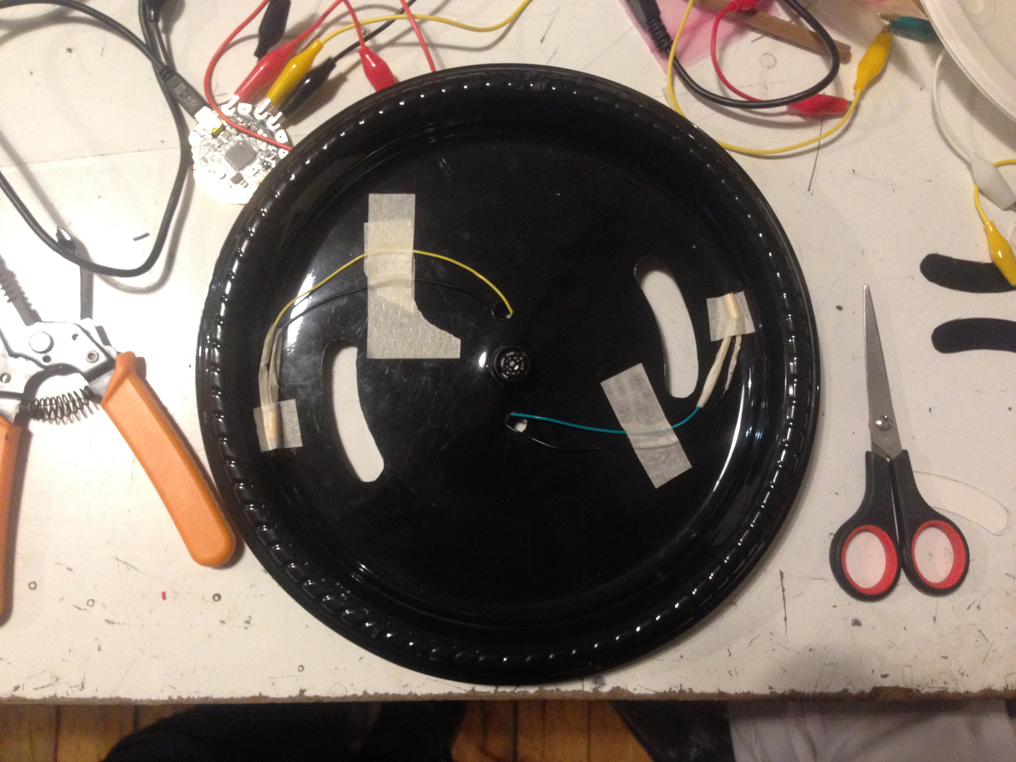
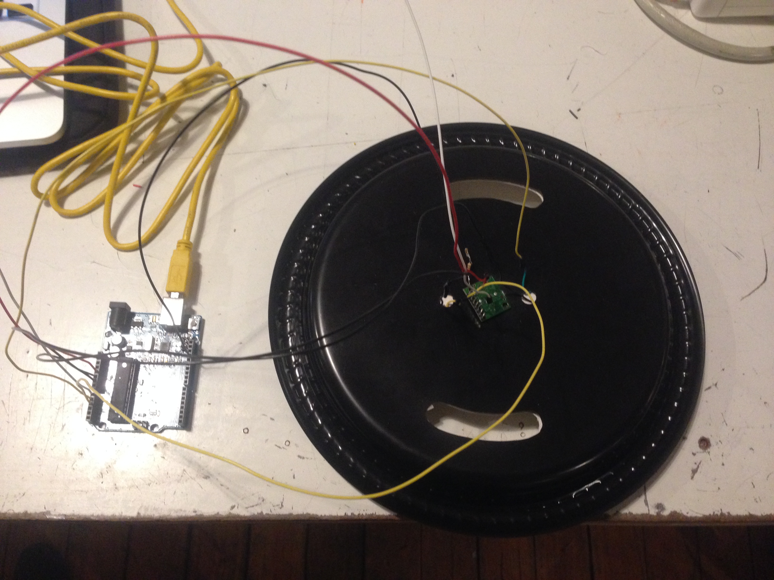
- Complete the wearable device!
- Bring in the dog!
Our ICM class was awesome. People disconnected their device from NYU wifi so we can track them and demo the visualization in real time. I’m gonna miss this class. Here’s a video of the demo in class.
doc5 from Jiashan Wu on Vimeo.
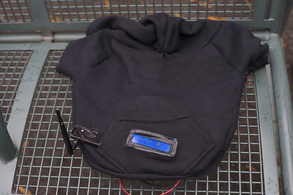
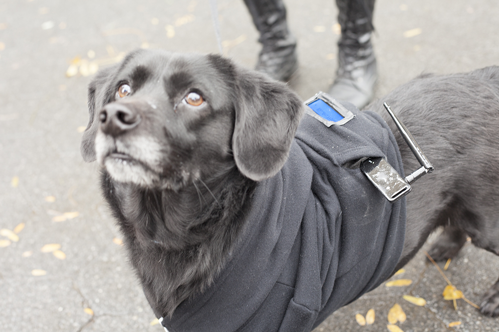 Snoopi is a data sniffing dog that sniffs out data from nearby mobile devices, data such as WiFi networks the device has connected to which can be used to track a person’s location history. This information is visualized in real time on a computer that connects remotely to Snoopi.