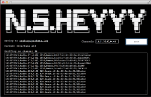
As a practice data visualization for our tagging game project, Data Leak, Ashley and I used wifi data that we gathered yesterday from Washington Square Park. We were able to pick up WiFi router information stored on some people’s devices using N.S.Heyy, a WiFi sniffer. The visualization shows roughly a 24hr period (N.S.Heyy was switched on and off). Those with a specific WiFi name are colored red, and the rest are colored gray. The distance to the center (our location) is measured by the strength of the signals. And the size of each circle is based on the number of probes.
Sample data and code is here.
Final iteration:
data vis4 from Jiashan Wu on Vimeo.
Without time scroller:
data vis3 from Jiashan Wu on Vimeo.
We started out visualizing each device based on its signal strength. This changed the distance between the device and our location.
data vis2 from Jiashan Wu on Vimeo.
Questions/issues:
- Many devices broadcasted multiple router names. I wanted to list them all, but couldn’t figure out how to store the multiple names in connection to one device address.
